Edge CRM
COMPANY
12 Grids
COMPANY
12 Grids
COMPANY
12 Grids
MODULE
12 Grids
SKILLS
Information-heavy UI
Usability testing
B2B Saas
ROLE
I was the sole UI/UX Designer working on this

What is Edge CRM ?
Edge CRM is an AI-driven platform helping B2B sales and support teams log, track, and resolve client cases, every single day.
Problem Statement
Field sales representatives and support leads at B2B companies, people who open Edge CRM multiple times a day, often mid-client-call, often in high-pressure moments where every second counts.
Outcome
A redesigned three-screen mobile flow - Add Case, Case List, and Case Detail - built so sales reps can log, triage, and act without the product slowing them down.
How Might We ?
How might we help the user’s to log, scan, and understand the full context of a client case , which will be fast, without having to navigate across multiple screens.
Add Case.
The entry point of the entire flow. Where every case begins and where most reps gave up.
Case List
The screen a rep opens every single morning. Ten or Twenty cases. All looked the same.
Case Details
The screen a rep opens mid-client-call — needing one answer, fast.

The Metrics
Every step in the old flow added time, effort, and cognitive load. By the time the rep had an answer the client had already lost confidence.

Every step in the old flow added time, effort, and cognitive load. By the time the rep had an answer the client had already lost confidence.
Entire Form
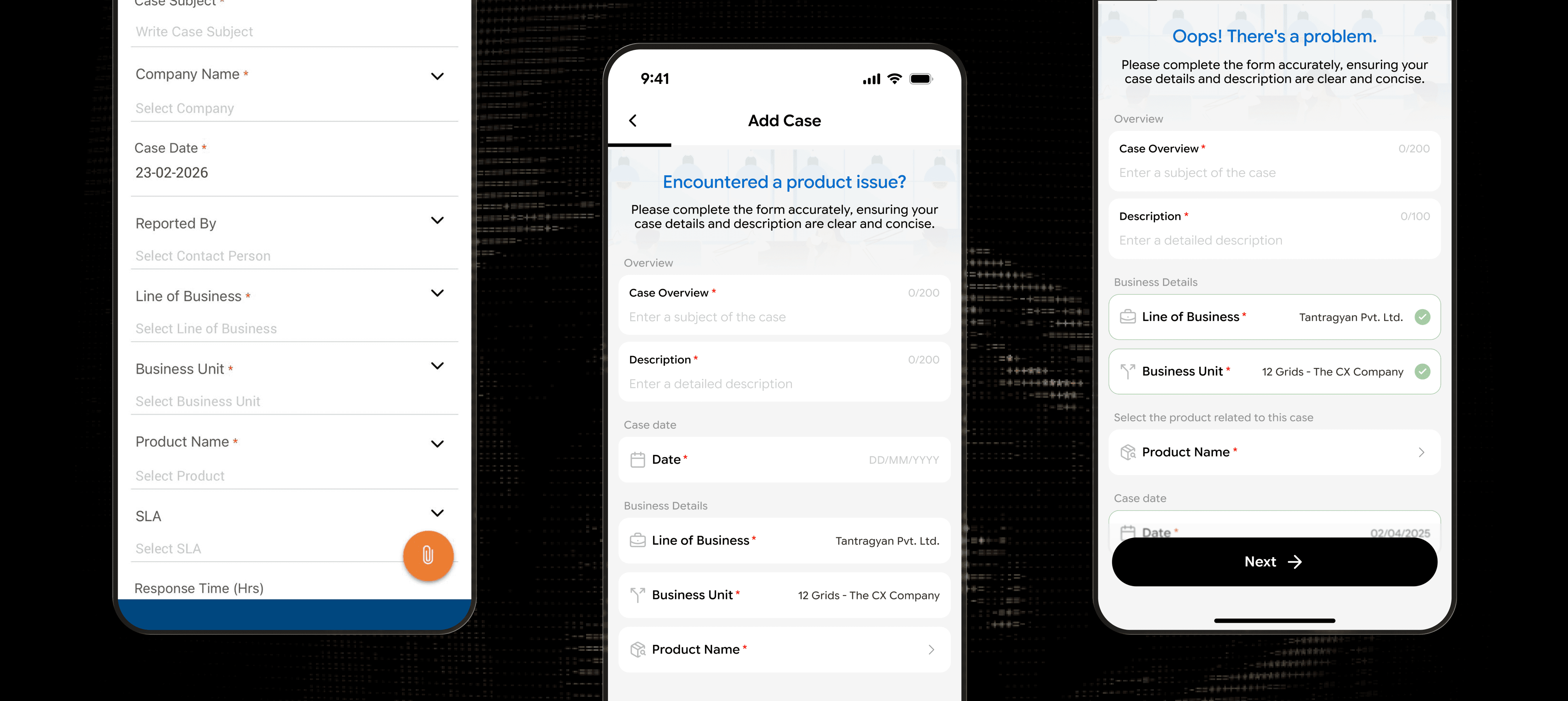
The form has no beginning and no end. One endless scroll with zero progress indicator. The rep has no idea how long this will take — so the brain defaults to avoidance.
Dropdown vs Text Field
Every field looks exactly the same. Underline inputs with a chevron. Is it a dropdown? Is it a text field? You won't know until you tap. That's one mistake per field, multiplied across an entire form.
Important Fields
Required and optional fields look identical. A red asterisk is the only signal. No visual grouping, no hierarchy, no way to know what's critical and what can wait.

Journey mapping & analysis
To trace the rep’s actual path through the flow, step by step and pinpoint exactly where time, effort, and confidence were being lost.
What went wrong :
No end in sight
No end in sight - reps scrolled to the bottom before filling anything.
Too much asked at once
Entire form on a single screen,
Text field or dropdown
Impossible to tell before tapping,
80% error rate
Same mistake, every rep, every session.

What did the research pointed out :
Card Borders
Every field needs a visible boundary,
Section Grouping
Fields organised under clear context headers,
Pre-filled values
Let the system remember what it already knows,
Ask less
Only surface fields that actually matter.

Brainstorming & Ideating
To translate every pain point into a concrete design direction and decide what to fix, what to remove, and what to rebuild.
Major Findings
Action’s to take
Brainstorming(Thinking out loud) - How can I solve it ?
Unstructured long form
Reps scroll first to estimate effort before filling.
Convert into a 3-step flow
Clear progress improves completion confidence.
Add a step progress bar at the top so reps immediately know how much of the form remains.
Break the long form into clear sections like Overview, Case Date, and Business Details to create a structured flow.
Add section labels at the top of each step so users always know the context of what they’re filling.
Fields looked visually identical
Reps confused dropdowns with text inputs.
Introduce clear field differentiation
Visual affordances guide correct interaction.
Replace underline inputs with card-style bordered fields to clearly communicate where interaction happens.
Add a chevron icon on dropdown fields so users instantly recognize selectable lists.
Use contextual icons for inputs such as calendar for dates, building for company, and person for reporter.
Validation feedback was unclear
Users refilled the entire form repeatedly.
Introduce explicit error guidance
Tell users exactly what failed and how to fix it.
Display a clear error banner at the top summarizing what needs to be fixed before submission.
Use specific error messages like “Please add a case subject” instead of generic validation errors.
Highlight failed inputs with a distinct red border to immediately draw attention to the problem field.
Re-designing
To turn those decisions into a working interface restructuring the form, clarifying the inputs, and giving reps a flow they could actually trust.


Broke the form into a stepped flow with a visible progress bar.
We developed a notification section designed to keep users informed about any issues
Grouped fields under clear section labels with card-bordered inputs and pre-populated known values.
Moved the primary CTA to a full-width pill button at the bottom

User Testing
To put the redesigned flow in front of real reps and measure whether the changes actually reduced time, errors, and confusion.
Form completion time reduced by 40%
Reps who previously took 3-4 minutes now completed the form in under 2 minutes.
The progress indicator at the top shows only a thin line
Reps couldn't tell how many steps were remaining or which step they were currently on.
Line of Business and Business Unit are
pre-filled
But reps didn't notice they were pre-filled and tried to tap on them to change the values.


Solutions - Action Items
To address the usability gaps that surfaced during testing and refine the design before final handoff.


We introduced Stepped tab flow, which consists Overview, Type, Assignee along with directional arrows showing the rep exactly where they are and where they're headed next.
Green border and tick icon on pre-filled fields. Line of Business and Business Unit are visually distinct from empty fields. The rep knows instantly what the system filled and what they need to fill themselves.
Contextual hint added above Product Name - "Select the product related to this case" - the rep knows exactly what the dropdown contains before they tap.
Final Design
This case study focused entirely on the Add Case screen, the entry point where every case begins.
